Microsoft Tweaks the Windows 10 Start Menu, Again
Click to read the full story: Microsoft Tweaks the Windows 10 Start Menu, Again

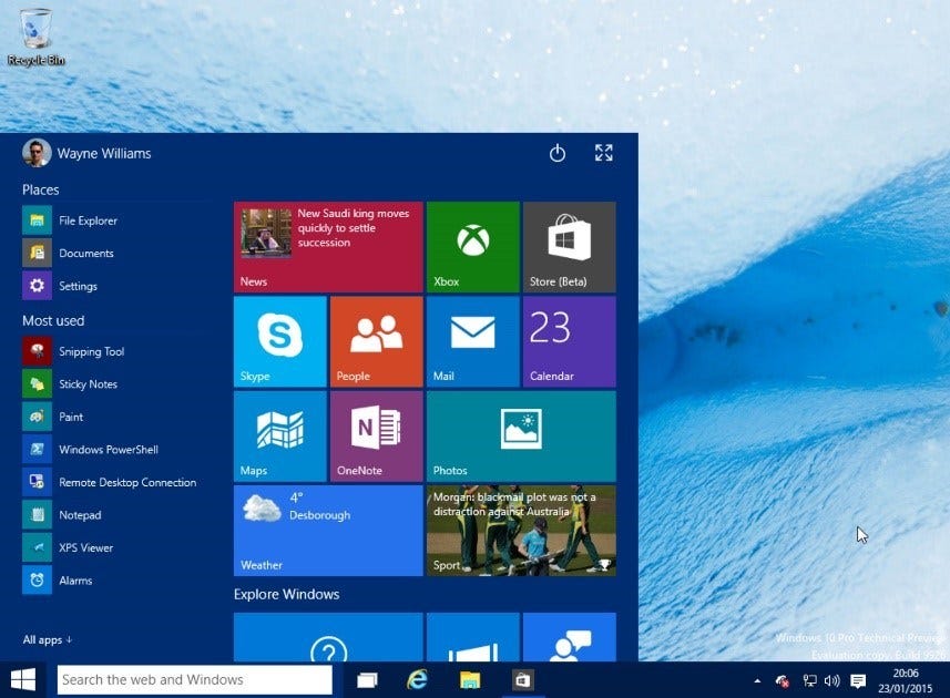
Microsoft seems to be having a tough time perfecting the Start Menu in Windows 10. Every major update to the operating has one or more Start Menu tweaks. The upcoming Windows 10 Anniversary Edition is no different. Microsoft hasn’t seemed to have really finalized the look and feel of their new Start Menu much to the detriment of Windows 10 users. It’s nice that Microsoft is trying their best (are they) to continually improve the Windows 10 experience but the whole exercise reeks of non-confidence, indecisiveness and a lack of ideas by those in charge of the Start Menu. Millions of Windows 7 users stand by their Start Menu, many of whom struggle to keep their systems from being upgraded for as long as possible because it simply works. These constant changes only seem to drive their point home.
I’ve been all for Windows 10 from the start (pun not intended). But these continuous Start Menu tweaks are getting ridiculous. Sure, they improve things. I appreciate the changes that make my life easier at the end of the day. It’s also appreciated many of that these changes come from Insider suggestions. Previous incarnations of the Windows 10 Start Menu did seem off. Will Microsoft find that elusive, perfect Start Menu for Windows 10? It is my hope though that Microsoft finally makes up its mind. It would really be irritating to go looking for something like Settings in one place only to find it elsewhere after another update.

So what changes should ordinary Windows 10 users expect?
Those in the fast ring of the Microsoft Insider Program are treated to the following changes.
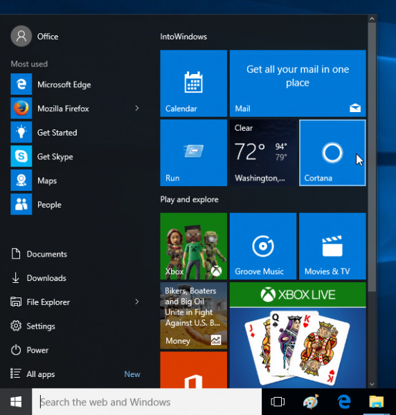
Power, Settings, File Explorer, Documents and Downloads are now all on the top of the All Apps Submenu in very minimalist little icons. They’re located at the left section as opposed to simple text the right in Windows 7. This minimizes mouse movements by users who often go to these areas. Aside from Documents and Downloads situated above the File Explorer, other folders can be displayed and hidden by going to Settings->Personalization->Start. It’s also good to see that Power is back to where it belongs, near the Start Button, just above All Apps, though some might argue that placing it at the top right corner as in previous builds, makes it less prone to accidental clicking. In the latest Build 14328, Power, Settings and File Explorer will also always be visible on the left rail even after clicking on the All Apps icon which was not the case for the previous Build 14316.
The most often used apps are now located at the top left of the Start menu. I count six on my fully expanded (not in Tablet Mode) Start Menu, each with their respective Jump Lists to recently used files or, in the case of browsers, visited sites. This feature can be turned off if the user doesn’t want to reveal to others what they do all day.
At the middle is a suggested apps section from Microsoft’s Windows Store. This goes at the top if Recently Used Apps is turned off. They still need to promote their walled garden of Universal Apps and could be helpful in the long run. It wouldn’t hurt, and one might encounter one of the few gems inside the store. This can be turned off if needed.
The Suggested Apps section is followed by the Recently Added apps. This is on by default and can display up to three recently added apps. This way, newly-installed apps are easily accessible unlike back then when users need to hunt it down by clicking on All Apps. On Windows 7, this appears as a highlighted app above All Programs.
As usual, tiled apps are shown at the right. Groups are now easily named by hovering the mouse over the group and clicking. Users are somewhat partial to these tiles, live or otherwise but they also serve as good shortcuts to frequently used apps can be used to glance info such as new tweets on Twitter, posts from Facebook, message headers for emails, news headlines and stock updates.
In tablet mode, Build 14328 allows the full-screen display of All Apps. Users can easily toggle between pinned tiles and all apps by tapping on the All Apps icon at the left rail. As per Microsoft Engineering for Systems VP, Gabe Aul, this is something that was missed by tablet users from Windows 8.1.
The Windows 10 Start Menu is by no means perfect. Whatever comes in the summer update, it will be there for a while unless Microsoft gets some massive backlash. The Start Menu is still a far cry from the old pretty Windows 7 Start Menu but is much more flexible. Let’s face it. Windows 10 is here and should be more improved by the upcoming Anniversary Update. If the Start Menu still isn’t your cup of tea, there’s always Classic Shell.
The post Microsoft Tweaks the Windows 10 Start Menu, Again appeared first on Movie TV Tech Geeks News By: Marius Manuella
